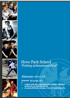
-Direct mode of address- eye contact,
helps them feel part of the magazine,
also helps catch the readers attention.
-Over lapping text over image
-Cover Lines, this gives a description of
what’s involved in the magazine
and what to expect.
-Strapline, in yellow, to try to get the words across.
-Three main colours; white, yellow and blue,
makes it look more organised.
-Big, bold masthead which immediately attracts the readers attention and draws them in.
-The magazine cover is very organised and all of the house styles of the magazine are matching which gives the front cover a sophisticated look.
-Girl jumping on trampoline
-The main character on the magazine has been represented by jumping on the trampoline, this shows a good and consistent sports college.
-Long shot picture, the setting takes up most of the frame
-Pupils in the background
-The featured pictures on the front cover clearly indicate a schooling environment, this helps the reader realise what this magazine is representing and what to expect to see inside the magazine.
-The colour in the background of the magazine helps make the pictures stand out, this will stand out to the audience and cause them to read the magazine.
-Different types of camera angles, but mainly medium shot and long shot pictures
-Pictures of students succeeding
-School year
-Transparent school logo on the magazine to make it stand out and add effect
-Strap line- "putting achievement first"
-White font, to make the writing look clear and stand out


No comments:
Post a Comment