
Saturday, 27 October 2012
Thursday, 25 October 2012
Evaluation of College Magazine
For my media project I had to sketch four sketches for my front cover magazine, and two content pages ideas for my content page, as I sketched them I had to choose one of my four sketches and sketch it on an A4 sheet of paper, as my final design.
I have chosen my first design because it is very eye catching as the picture will involve a group of girls hugging in a medium close up picture as my magazine front cover picture. I also included another picture which will be in the bottom right hand corner to make it more vivid. I like my design because I think it is very friendly and suitable for any age group.
After I designed my four sketches I had to conduct a questionnaire to collect ideas and information of how to design my magazine apart from my picture for example the strap line and the title. Another reason why I chose my first design because it is going to include a lot of information in the front cover, which are cover lines. Also the idea of having a logo is to represent the school and to show maturity and respect of the school. The idea of having a strapline is to summarise in an approrpiate way.
I didn’t chose my other designs because they only had one main picture and the main picture had one person taken in it, the idea of having more than one picture in the front cover will make it sensational. I also think that having a friend or group picture will represent the school as a friendly environment, and will give a positive reputation of the school by just looking at the picture.
For the softwares I used Photoshop and GIMP to manipulate and edit the pictures, and I found the softwares very useful and easy to use, however I didn’t use InDesign because I didn’t find it useful and very different from Photoshop.
Overall I think my front cover turned out really well and how I wanted it to be, however I could of improved it by adding another picture, to make it appealing. For my contents page I could have improved it by adding more effect to the background and changing the style of the contents list. Finally I am pleased with my work.
.

Wednesday, 24 October 2012

Details of My Magazine
For my magazine front cover the main image will be a picture of a group of girls hugging each other I also decided to make a logo which will be at the top in the right hand corner. My title will be at the top and below the title there will be a strapline.
At the bottom right hand corner of my magazine there will be a picture of a school boy with a medal, which is an evidence of achievements and sports events. And finally at the bottom of my magazine there will be a list of features of what’s inside the magazine. :)
which are:
- Title page
- Strapline
- Logo
- Style and Tone
- Target audience which is for parents
- Colour scheme which are Blue, White and Black which are the final results from my questionnaire
which are:
- Title page
- Strapline
- Logo
- Style and Tone
- Target audience which is for parents
- Colour scheme which are Blue, White and Black which are the final results from my questionnaire
Final Sketch of Front Cover

Thursday, 11 October 2012
College Magazine Questionnaire, Analysis and Evalutaion
For my college magazine I conducted a questionnaire to research what my target audience would prefer interms of design and content of a college magazine which is parents and students, this is a tally of my questionnaire results.
1. What is your gender?
Male llll ll Female llll lll
2. Please specify your gender?
16-18 lllll lllll l 26-35 ll
3. How often do you read school magazines?
Always Usually Often l Sometimes lll Rarely llllll Never ll Don't Know l
4. Which title from below would you prefer on a school magazine?
Life In Hove Park lllll l
Hove Park Times ll
The Nevill Way llll
5. Which three main colours would you prefer on a school magazine?
Light Blue, White, Dark Blue lllll ll
Black, Blue, White llll
Blue, White, Grey ll
6. Which two of the fonts below would you prefer on a school magazine front cover?
Hove Park ll Hove Park lll Hove Park ll Hove Park llll
Hove Park llll Hove Park lllll ll Hove Park lll Hove Park lll
7. Which of the following straplines, would suit in the school magazine?
Ahievement Through Caring lll
We Enter To Learn, Leave To Achieve lllll l
Creating A Community Of Life-Long Learners l
Where Students Come First lll
8. What kind of features would you like to be included in a school magazine?(please tick 6)
Headmasters notes lllll lll Drama and Music lllll lll
Achievements and awards lllll lll Photos of students contributing lllll l
Sports and events lllll ll Key term dates lllll l
School trips lllll lll Visitors or Contributors ll
Statistics of results lllll l Students and Parents Quotes ll
Art work lllll lll Upcoming events lllll ll
9. Which style do you prefer reading your magazine?
Print lllll ll PDF llll Computer ll
Looking at my questionnaire I think that it helped me a lot with my college magazine and gave me ideas of how to create it, it told me which fonts I had to use (hobo std) and which strapline and headlines would fit best, however I could have improved it by logos for people to choose. I have also found out that they don't really read college magazines, due to the load or texts, however I have found out that they'll enjoy looking at pictures of students such as pictures of school trips, drama and art pictures as well. Also looking at achievements and and stastistics and results.
Wednesday, 10 October 2012
College Magazine Annotations
These are two school magazines that I annotated, for my college magazine.
 -Logo, to represent the college
-Direct mode of address- eye contact,
 -Logo, to represent the college
-Direct mode of address- eye contact,
helps them feel part of the magazine,
also helps catch the readers attention.
-Over lapping text over image
-Cover Lines, this gives a description of
what’s involved in the magazine
and what to expect.
-Strapline, in yellow, to try to get the words across.
-Three main colours; white, yellow and blue,
makes it look more organised.
-Big, bold masthead which immediately attracts the readers attention and draws them in.
-The magazine cover is very organised and all of the house styles of the magazine are matching which gives the front cover a sophisticated look.
-Girl jumping on trampoline
-The main character on the magazine has been represented by jumping on the trampoline, this shows a good and consistent sports college.
-Long shot picture, the setting takes up most of the frame
-Pupils in the background

-The featured pictures on the front cover clearly indicate a schooling environment, this helps the reader realise what this magazine is representing and what to expect to see inside the magazine.
-The colour in the background of the magazine helps make the pictures stand out, this will stand out to the audience and cause them to read the magazine.
-Different types of camera angles, but mainly medium shot and long shot pictures
-Pictures of students succeeding
-School year
-Transparent school logo on the magazine to make it stand out and add effect
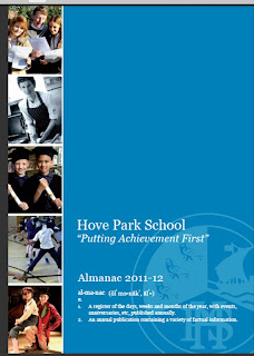
-Strap line- "putting achievement first"
-White font, to make the writing look clear and stand out
Flat Plan Of College Magazine Front Cover


These are my four draft designs for my college magazine front cover, I annotated my four designs and I had to draw two initial ideas for my contents page and add features of what the magazine contains.

Tuesday, 9 October 2012
Pictures for my College Magazine
These are some of the pictures I have taken around the school with my camera, for my college magazine.

This is a long shot image as the setting (field) is shown and gives a general impression, as its taken from distance.

This is a picture of students working in the computer rooms, it is a wide angle medium close up as its taken from waist up.

This is a picture taken of two students working in their ICT lesson, it is a medium long shot as well as a wide angle as everything appears to be in the picture.

This picture is taken of a school girl studying, it is a wide angle mid-shot and its an aerial shot as its taken from above looking down.
Subscribe to:
Posts (Atom)